Data Science & Mathematical Tools
Units 1 and 2
General descriptions of the units are provided below:
Unit 1: A Country’s Shape
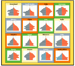
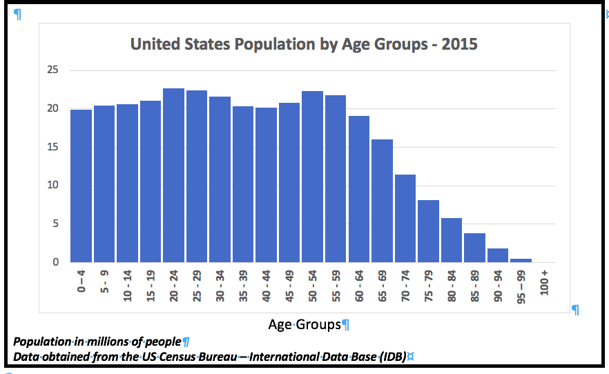
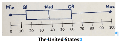
This unit defines shape based on the population distribution as displayed by a country’s population pyramid graph and resulting histogram. Specific age groups are analyzed to highlight significant features of each country’s population. Summaries include the age groups representing the greatest percent of the population, a ratio of old-to-young, and general descriptions based on the defined shape of a country. The implications of these summaries are also developed in the problems and the data stories.
Unit 2: Looking Back
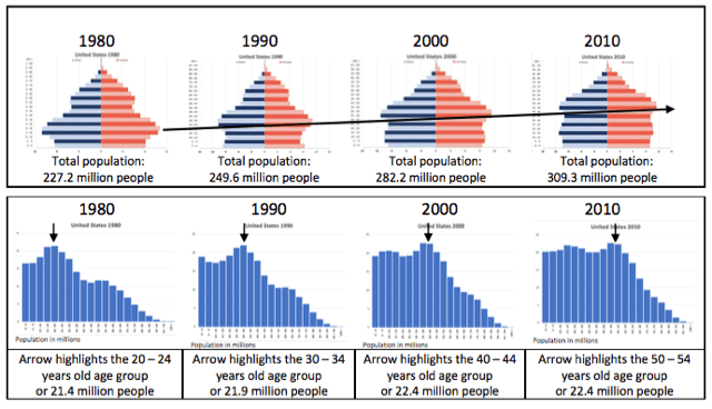
A country’s shape is a result of many factors that emerge by studying the past and the most current population pyramid graphs and histograms. This unit develops a timeline that analyzes both past distributions and the resulting connection to 2015. In Lesson 6, the timeline identifies the emergence of two significant subgroups that result in the unique shape of the United States population distribution-namely, the Baby Boom Generation and the Millennial Generation. Events that resulted in a change in the count of people over time are identified in the lessons and traced through several decades.


